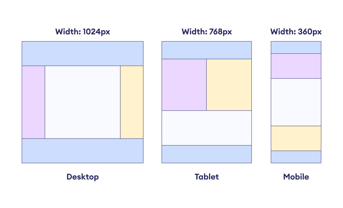
Responsive web design is an approach to web development aimed at creating websites that adapt and respond to different screen sizes and devices.
The primary goal of responsive design is to provide an optimal and consistent user experience across a wide range of platforms, including desktop computers, laptops, tablets, and smartphones.
The following diagram shows how responsive web design allows the layout to adapt to various user devices without compromising user experience.

CSS Media Queries
Media queries are CSS rules that apply specific styles and layout adjustments based on various conditions, such as screen size, resolution, orientation, or other device characteristics.
Media queries are essential for creating responsive and adaptive web designs that look and function optimally across different devices and screen dimensions.
Let's look at an example.
@media (min-width: 768px) {
  /* This style rule will only apply when the width
    of the viewport is at least 768px */
  .container {
    width: 50%;
  }
}
Here, the CSS enclosed in a media query will be applied only when the minimum width of the device is 768px.
Responsive Column Layout
Column layout refers to the arrangement of content on a webpage in multiple columns. This allows us to organize and present information in a structured and visually appealing manner.
There are several column layout configurations: 3-column, 2-column, and 1-column layouts.
Let's see how we can make responsive column layouts.
<!DOCTYPE html>
<html lang="en">

    <head>
        <meta charset="UTF-8" />
        <meta name="viewport" content="width=device-width, initial-scale=1.0" />
        <link rel="stylesheet" href="style.css" />
        <title>CSS Column Layout</title>
    </head>

    <body>
        <header>HEADER</header>
        <main>
            <div class="column column1">COLUMN 1</div>
            <div class="column column2">COLUMN 2</div>
            <div class="column column3">COLUMN 3</div>
        </main>
        <footer>FOOTER</footer>
    </body>

</html>
/* making a three column layout */
main {
    display: flex;
    flex-wrap: wrap;
    height: 100px;
    text-align: center;
}

.column1 {
    /* width takes 20% of the flex container */
    width: 20%;
    background-color: orange;
}

.column2 {
    /* width takes 60% of the flex container */
    width: 60%;
    background-color: yellow;
}

.column3 {
    /* width takes 20% of the flex container */
    width: 20%;
    background-color: greenyellow;
}

header,
footer {
    text-align: center;
    background-color: pink;
}
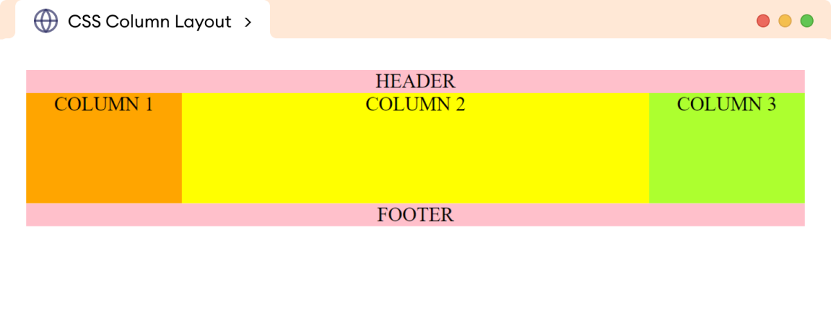
Browser Output

In the above example, the flex property allows us to create three column layouts.
This type of layout is generally used for desktops and laptops to arrange different types of content in different columns.
For example, a three-column layout might be used in a news website to display headlines in one column, featured articles in another, and advertisements in the third.
Now, using flex properties and media queries, we can change the above three-column layout to a two-column layout.
@media screen and (max-width: 768px) {
/* set column1 and column2 to 50% width each */
    .column1,
    .column2 {
        width: 50%;
    }

/* set column3 to 100% width */
    .column3 {
        width: 100%;
    }
}
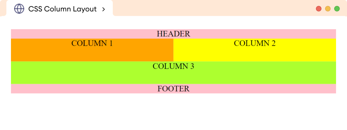
Browser Output

The above CSS styles change the three-column layout to a two-column layout for tablets and smaller devices.
Finally, for mobile devices with smaller widths, we can set the following styles to achieve a single-column layout.
@media screen and (max-width: 800px) {
    .column1,
    .column2,
    .column3 {
        width: 100%;
    }
}
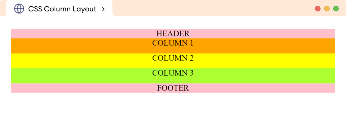
Browser Output

In this way, media queries are used to create a responsive web layout for the various devices.