The CSS box-sizing property specifies how the width and height of an element are calculated.
The box-sizing property lets us control how the box model behaves. It allows us to include the padding and border within the overall width and height of the element.
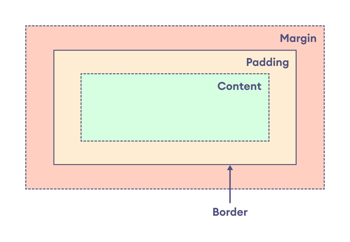
According to the box model, every element on the webpage is treated as a rectangular box. The following diagram shows the layout with the box model:

CSS box-sizing Syntax
The syntax of the box-sizing property is as follows,
box-sizing: content-box | border-box | initial | inherit;
Here,
content-box: defines thewidthandheightbased on the content of the element, excluding thepaddingandborderborder-box: defines thewidthandheightbased on the border, including thepaddingandborderinitial: sets the default value i.e.content-boxinherit: inherits the value from the parent element
Width and Height Without Box-sizing
The width and height properties are applied to the content of an element by default. The actual width and height are calculated as:
actual width: border-left + padding-left + width + padding-right + border-right

actual height: border-top + padding-top + height + padding-bottom + border-bottom
This causes the width and height to be larger than the actual specified value after padding and border are added.
Let's see an example,
<!DOCTYPE html>
<html lang="en">

    <head>
        <meta charset="UTF-8" />
        <meta name="viewport" content="width=device-width, initial-scale=1.0" />
        <link rel="stylesheet" href="style.css" />
        <title>CSS box-model</title>
    </head>

    <body>
        <div>
            This div element has a width of 300px and a height of 200px. By
            default, the width and height are applied to the content of an element
            i.e. box-sizing is set to content-box.
        </div>
    </body>

</html>
div {
    width: 300px;
    height: 200px;
    padding: 20px;
    border: 10px solid black;
    margin: 20px;

    /* default value */
    box-sizing: content-box;

    background-color: greenyellow;
    /* clips the background color to content only */
    background-clip: content-box;
}
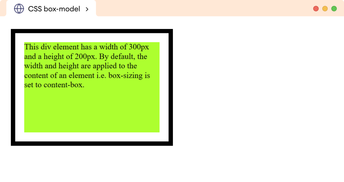
Browser Output

In the above example, even though we have set the width to 300px and height to 200px, the actual width and height are rendered as:
actual width = 10px + 20px + 300px + 20px + 10px
actual height = 10px + 20px + 200px + 20px + 10px
Hence, the actual width and height are set to 360px and 260px, respectively.
Width and Height With Box-sizing
The border-box value of the box-sizing property allows us to include the padding and border to the specified value of width and height. For example,
<!DOCTYPE html>
<html lang="en">

    <head>
        <meta charset="UTF-8" />
        <meta name="viewport" content="width=device-width, initial-scale=1.0" />
        <link rel="stylesheet" href="style.css" />
        <title>CSS box-model</title>
    </head>

    <body>
        <div>
            This div element has a width of 300px and a height of 200px. By
            default, the width and height are applied to the content of an
            element i.e. box-sizing is set to content-box.
        </div>
    </body>

</html>
div {
    width: 300px;
    height: 200px;
    padding: 20px;
    border: 10px solid black;
    margin: 20px;

    box-sizing: border-box;
    background-color: greenyellow;

    /* clips the background color to content only */
    background-clip: content-box;
}
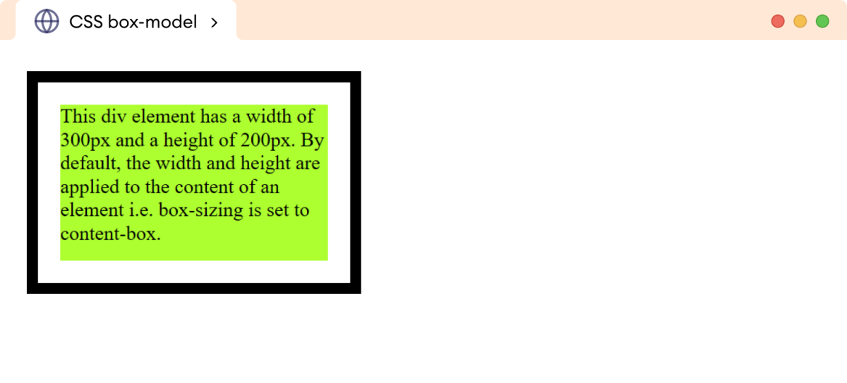
Browser Output

In the above example, box-sizing: border-box allows the padding and border to be included within the specified width and height.
Hence, the width and height of the div will remain exactly 300px and 200px, respectively.
Developers often prefer using the border-box value as it helps to control the size of an element, ensuring consistent and predictable results for the design.
Note: We can set the box-sizing to border-box for all elements using the universal selector (*). For example,
* {
    box-sizing: border-box;
}