CSS Flexbox provides an easy way to create responsive and dynamic designs that adapt to various screen sizes and devices.
The responsive layout allows the webpage to reshape and resize based on the size of the screen it's viewed on. This ensures a consistent user experience.
Flexbox is ideal for responsive layouts due to its automatic container resizing, flexible item sizing, and easy alignment control.
Column Layouts Using CSS Flex
Column layout refers to the arrangement of content on a webpage in multiple columns. This allows us to organize and present information in a structured and visually appealing manner.
There are several common column layout configurations: 3-column, 2-column, and 1-column layouts.
Let's see how CSS flex can be used to achieve different column layouts.
<!DOCTYPE html>
<html lang="en">

    <head>
        <meta charset="UTF-8" />
        <meta name="viewport" content="width=device-width, initial-scale=1.0" />
        <link rel="stylesheet" href="style.css" />
        <title>CSS Column Layout</title>
    </head>

    <body>
        <header>HEADER</header>
        <main>
            <div class="column column1">COLUMN 1</div>
            <div class="column column2">COLUMN 2</div>
            <div class="column column3">COLUMN 3</div>
        </main>
        <footer>FOOTER</footer>
    </body>

</html>
/* making a three column layout */
main {
display: flex;
flex-wrap: wrap;
height: 100px;
text-align: center;
}
.column1 {
/* width takes 20% of the flex container */
width: 20%;
background-color: orange;
}
.column2 {
/* width takes 60% of the flex container */
width: 60%;
background-color: yellow;
}
.column3 {
/* width takes 20% of the flex container */
width: 20%;
background-color: greenyellow;
}
header,
footer {
background-color: pink;
text-align: center;
}Browser Output
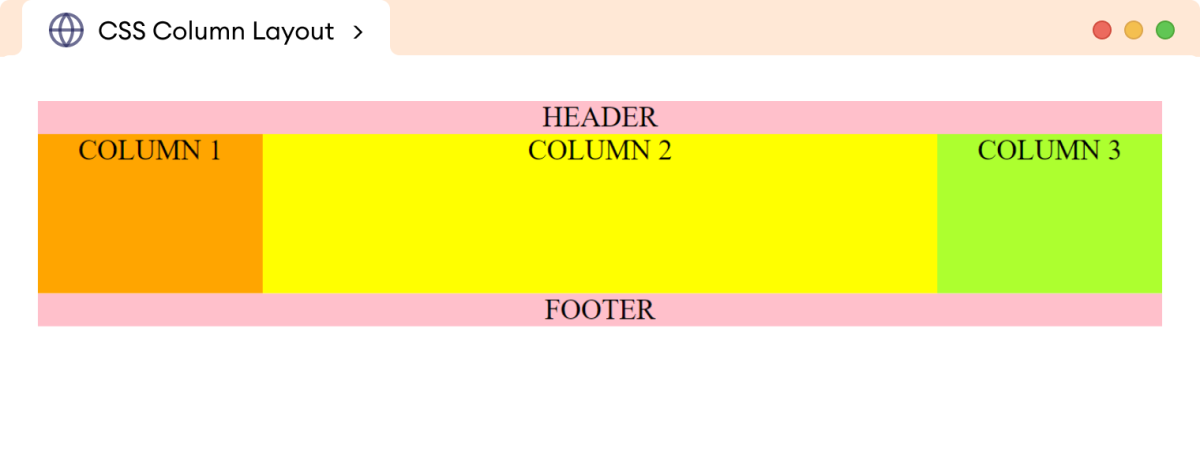
In the above example, we used the flex property to create three column layouts. This type of layout is generally used for desktops and laptops to arrange different types of content in different columns.
For example, a three-column layout might be used in a news website to display headlines in one column, featured articles in another, and advertisements in the third.
Now, using flex properties and media queries, we can change the above three-column layout to a two-column layout.
@media screen and (max-width: 768px) {
/* set column1 and column2 to 50% width each */
    .column1,
    .column2 {
        width: 50%;
    }

/* set column3 to 100% width */
    .column3 {
        width: 100%;
    }
}
Browser Output
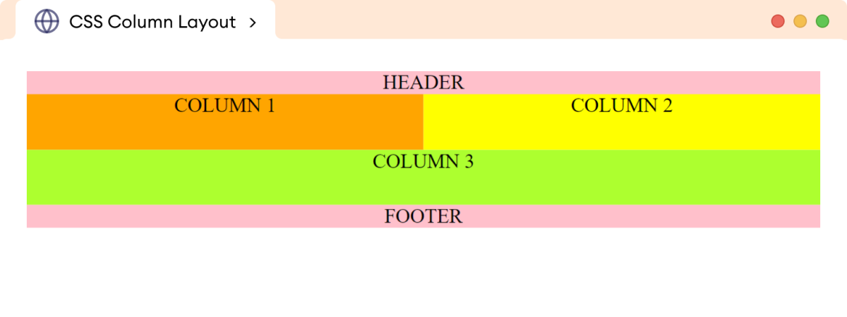
The above CSS styles change the three-column layout to a two-column layout for tablets and smaller devices.
Note: CSS @media query is a CSS rule that
allows you to apply different CSS styles to a web page depending on the
device or screen size it is being viewed.
Finally, for mobile devices with smaller widths, we can set the following styles to achieve a single-column layout.
@media screen and (max-width: 450px) {
    .column1,
    .column2,
    .column3 {
        width: 100%;
    }
}
Browser Output
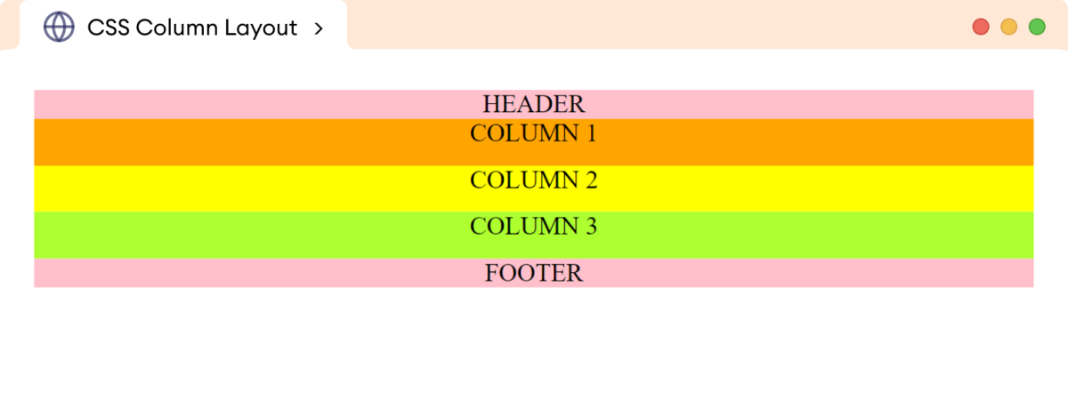
In this way, the flex property can be used together with media
queries to achieve multiple column layouts depending on the screen sizes.
Example: Image Gallery Using CSS Flex
The flex property can be used to create a responsive image
gallery that adapts to different screen sizes.
We can use three-column layouts for desktop and laptop displays, a two-column layout for tablets, and finally, a single-column layout for mobile devices.
Let's look at an example.
<!DOCTYPE html>
<html lang="en">

    <head>
        <meta charset="UTF-8" />
        <meta name="viewport" content="width=device-width, initial-scale=1.0" />
        <link rel="stylesheet" href="style.css" />
        <title>CSS Flex Gallery</title>
    </head>

    <body>
        <div class="gallery">
            <img
                src="https://images.pexels.com/photos/3408744/pexels-photo-3408744.jpeg"
                alt="Northern Winter Sky Image"
            />
            <img
                src="https://images.pexels.com/photos/1142950/pexels-photo-1142950.jpeg"
                alt="Shining Stars Image"
            />
            <img
                src="https://images.pexels.com/photos/3933881/pexels-photo-3933881.jpeg"
                alt="A River Flowing Image"
            />
            <img
                src="https://images.pexels.com/photos/5409751/pexels-photo-5409751.jpeg"
                alt="A cloudy Mountain Image"
            />
            <img
                src="https://images.pexels.com/photos/4101555/pexels-photo-4101555.jpeg"
                alt="A Winter Rainbow Image"
            />
            <img
                src="https://images.pexels.com/photos/443446/pexels-photo-443446.jpeg"
                alt="A Clean Mountain Lake"
            />
        </div>
    </body>

</html>
/* flex container */
div.gallery {
display: flex;
flex-wrap: wrap;
Border: 1px solid black;
}
/* flex items */
img {
width: 33%;
height: 180px;
margin: 2px;
}Browser Output






In the above example, each image (flex item) has a width of
33% of the entire gallery (flex container). The images wrap
into multiple lines due to the flex-wrap property.
For tablet devices, we can change the three-column layout above into a two-column layout.
@media screen and (max-width: 768px) {
    img {
        width: 49%;
        height: 250px;
	  margin: 16px;
    }
}
This will cause the individual flex items to occupy 49% of the
container's width for devices with a maximum width of 768px.
Browser Output


Finally, for mobile devices, we can adjust the flex item's width to span
100% of the container.
@media screen and (max-width: 480px) {
    img {
        width: 100%;
        height: 400px;
    }
}
Browser Output


In this way, CSS flex layout allows containers and items to be flexible. This means that the items can be resized and repositioned to fit the available space.
This is the essence of flex-based layouts.