The CSS box model is a fundamental concept that defines how the element's dimensions and spacing are calculated.
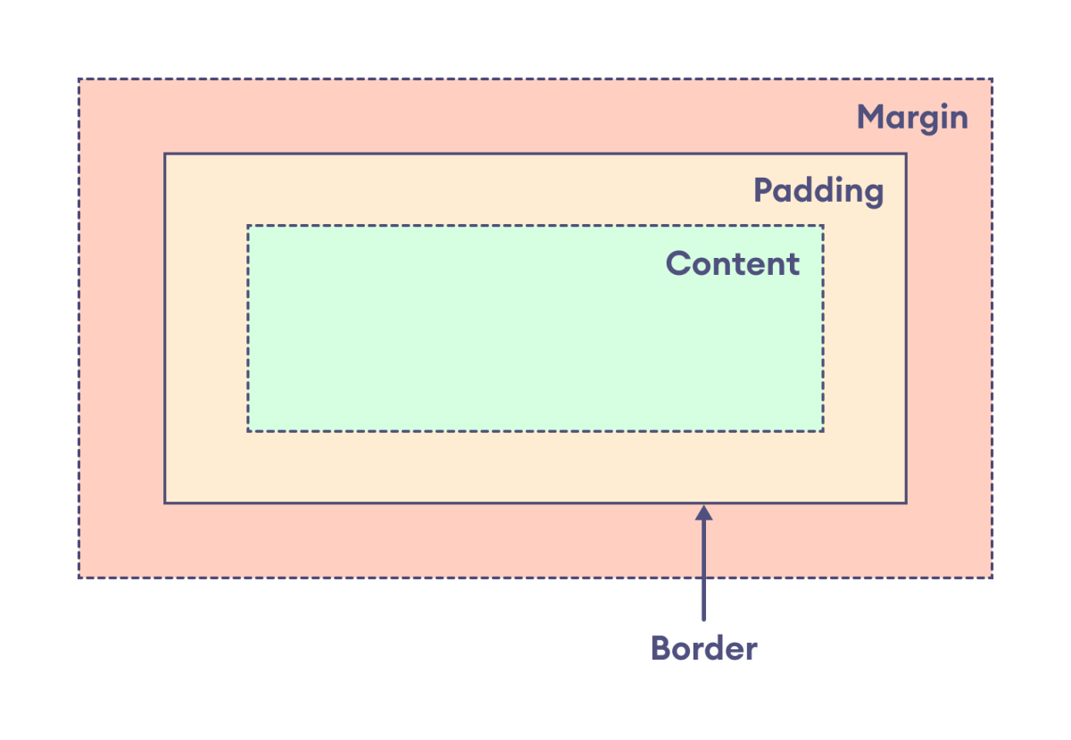
The box model treats every HTML element as a rectangular box consisting of content, padding, border, and margin.
The box model defines the layout of an HTML element in the following way:

The components of the box model are:
content: actual text or image that is displayed in the elementpadding: transparent space between the content and the border of an elementborder: line that surrounds the padding and content within the elementmargin: transparent area added outside the border
The primary purpose of the box model is to explain how the dimensions and spacing of elements are calculated and how they relate to each other.
Width and Height of an Element with Box Model
The box model is important for understanding how the width and height of an element are calculated.
The width and height of the element are applied only to the content of the element by default. Hence, the actual size of the element is calculated by adding the padding and border along with the specified width and height of the element.
Actual width: border-left + padding-left + width + padding-right + border-right

Actual height: border-top + padding-top + height + padding-bottom + border-bottom
Let's see an example,
<!DOCTYPE html>
<html lang="en">

    <head>
        <meta charset="UTF-8" />
        <meta name="viewport" content="width=device-width, initial-scale=1.0" />
        <link rel="stylesheet" href="style.css" />
        <title>CSS Box Model</title>
    </head>

    <body>
        <div>
            The CSS box model is a way of describing the layout of an HTML
            element.
        </div>
    </body>

</html>
div {
width: 400px;
height: 80px;
border: 10px solid black;
padding: 15px;
background-color: greenyellow;
/* clips the background color to content only */
background-clip: content-box;
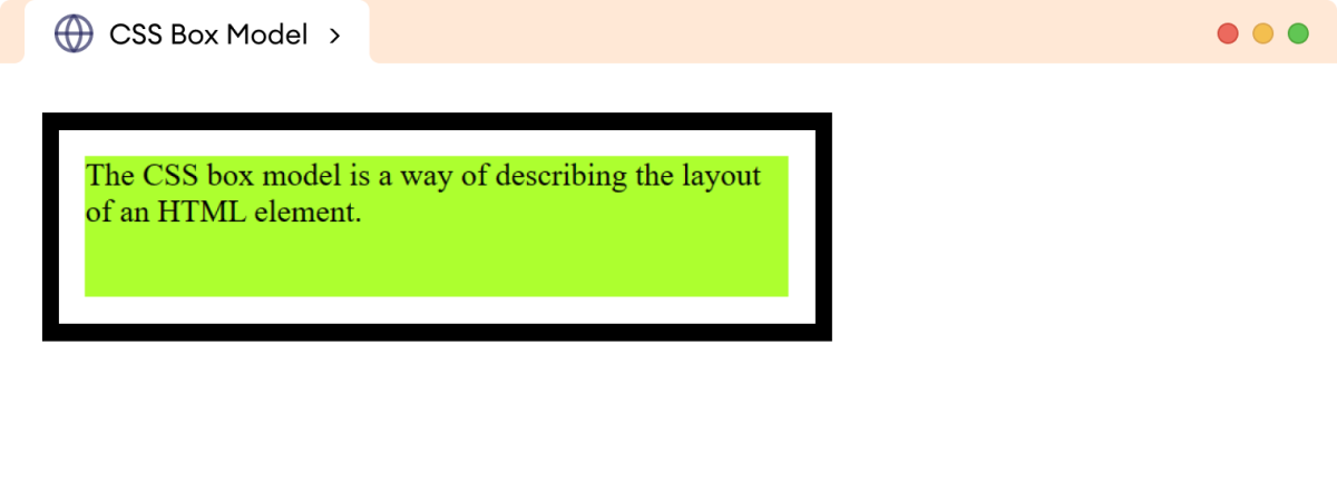
}Browser Output

In the above example, we have specified
div {
    width: 400px;
    height: 80px;
    border: 10px solid black;
    padding: 15px;
}
The width and height of the div are applied only to the content of the element. The actual width and height of the element are:
width = 10px + 15px + 400px + 15px + 10px = 450px
height = 10px + 15px + 80px + 15px + 10px = 130px
Hence, the actual width becomes 450px, and the height becomes 130px.
Note: The margin is not added to calculate the actual size of the box, even though it affects the total space the box takes on the page. The border marks the boundary of the box area, and it does not extend into the margin.
Box Model With Inline Elements
The box model is applied differently to inline elements. This is because inline elements don't have a default width or height and occupy space based on the size of their content.
Let's see an example,
<!DOCTYPE html>
<html lang="en">

    <head>
        <meta charset="UTF-8" />
        <meta name="viewport" content="width=device-width, initial-scale=1.0" />
        <link rel="stylesheet" href="style.css" />
        <title>CSS Box Model</title>
    </head>

    <body>
        <p>
            The box model works differently for inline elements. For example,
            this <span>span</span> element does not work as expected.
        </p>
    </body>

</html>
p {
width: 350px;
border: 1px solid black;
}
span {
width: 100px;
height: 40px;
border: 5px solid black;
padding: 10px;
margin: 10px;
background-color: greenyellow;
}Browser Output

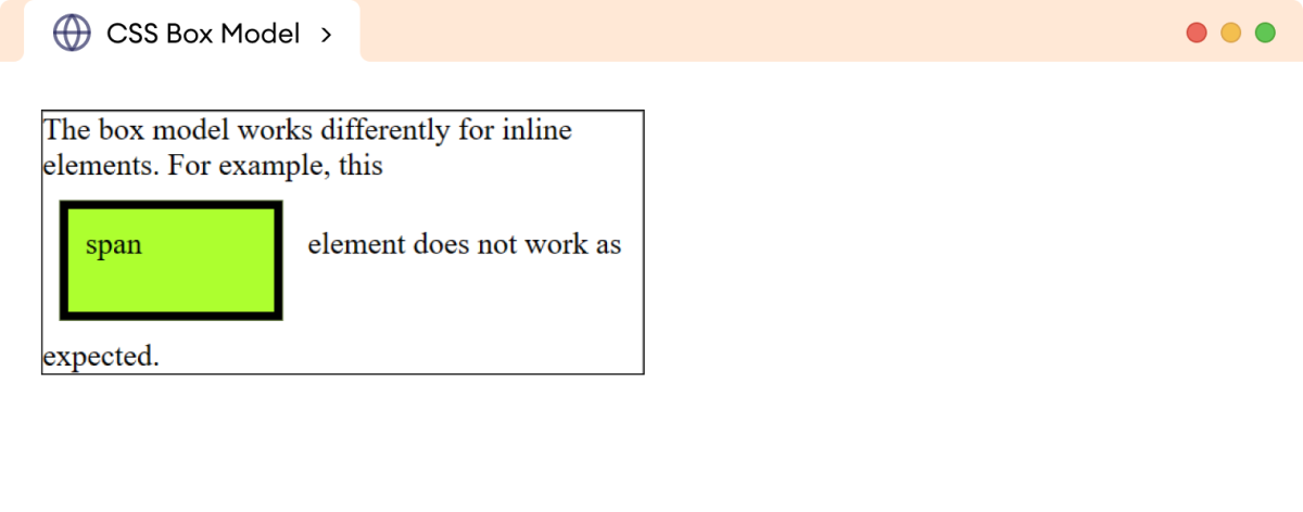
In the above example,
- The
heightandwidthare ignored. - The
topandbottommargins are also ignored, and only theleftandrightmargins work. - The
paddingworks for all four sides of the elements.
Hence, we cannot calculate the actual dimensions of the inline element.
In order to apply the box model in the inline elements, the display property should be changed to either inline-block or block.
Let's see an example with inline-block,
<!DOCTYPE html>
<html lang="en">

    <head>
        <meta charset="UTF-8" />
        <meta name="viewport" content="width=device-width, initial-scale=1.0" />
        <link rel="stylesheet" href="style.css" />
        <title>CSS Box Model</title>
    </head>

    <body>
        <p>
            The box model works differently for inline elements. For example,
            this <span>span</span> element does not work as expected.
        </p>
    </body>

</html>
p {
width: 350px;
border: 1px solid black;
}
span {
display: inline-block;
width: 100px;
height: 40px;
border: 5px solid black;
padding: 10px;
margin: 10px;
background-color: greenyellow;
}Browser Output

In the above example, the box model works as expected. The actual width and height of the span element are calculated as:
width = 5px + 10px + 100px + 10px + 5px = 130px
height = 5px + 10px + 40px + 10px + 5px = 70px
Hence, the actual width and height become 130px and 70px respectively.
Note: The default behavior of the box model can be changed by the box-sizing property allowing developers to set the width and height intuitively.
You can learn more about the box-sizing property.