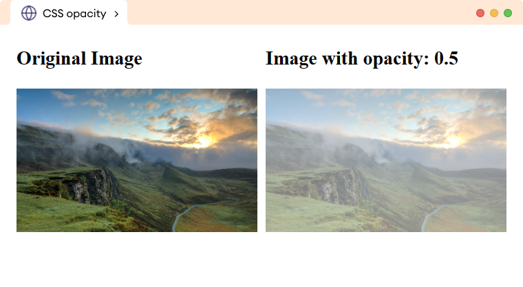
CSS opacity property specifies the transparency level of an element. For example,
img.second {
    opacity: 0.5;
}
Browser Output

Here, the opacity: 0.5 sets the opacity of the second image to 0.5 which means that the image will be 50% transparent.
CSS opacity Syntax
The syntax of the opacity property is,
opacity: number | initial | inherit;Here,
number: sets the opacity level in the range from0.0(fully transparent) to1.0(fully opaque)initial: sets the property value to the default value (1.0)inherit: inherits the property value from its parent element
The opacity value of 1.0 is equivalent to 100%.
Note: The opacity property affects not only the element itself but also any child elements or content present within it.
CSS Opacity With Background Color
Sometimes we need to set a little bit of transparency to the background color. For example,
<!DOCTYPE html>
<html lang="en">

    <head>
        <meta charset="UTF-8" />
        <meta name="viewport" content="width=device-width, initial-scale=1.0" />
        <link rel="stylesheet" href="style.css" />
        <title>CSS opacity</title>
    </head>

    <body>
        <div class="box box1"><h2>opacity: 1.0</h2></div>
        <div class="box box2"><h2>opacity: 0.7</h2></div>
        <div class="box box3"><h2>opacity: 0.3</h2></div>
        <div class="box box4"><h2>opacity: 0.1</h2></div>
    </body>

</html>
/* styles the div */
div.box {
height: 100px;
background-color: orange;
}
div.box1 {
opacity: 1;
}
div.box2 {
opacity: 0.7;
}
div.box3 {
opacity: 0.3;
}
div.box4 {
opacity: 0.1;
}Browser Output

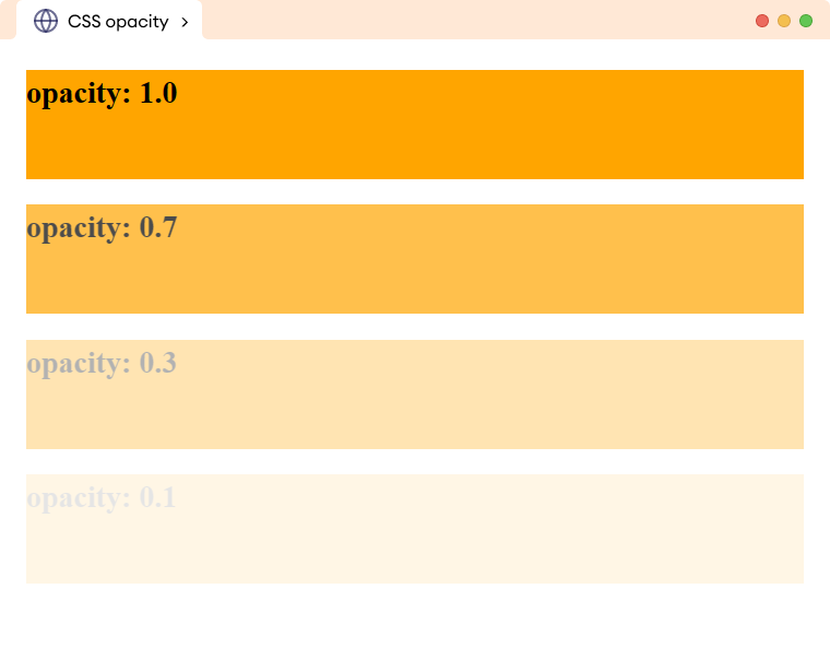
In the above example, the opacity of the div also affects the content of the h1 element. This makes the text hard to read.
We can overcome this issue with the background-color property using the RGBA color value with the required opacity.
Let's see an example,
<!DOCTYPE html>
<html lang="en">

    <head>
        <meta charset="UTF-8" />
        <meta name="viewport" content="width=device-width, initial-scale=1.0" />
        <link rel="stylesheet" href="style.css" />
        <title>CSS opacity</title>
    </head>

    <body>
        <div class="box box1"><h2>opacity: 1.0</h2></div>
        <div class="box box2"><h2>opacity: 0.7</h2></div>
        <div class="box box3"><h2>opacity: 0.3</h2></div>
        <div class="box box4"><h2>opacity: 0.1</h2></div>
    </body>

</html>
/* styles the div */
div.box {
height: 100px;
background-color: orange;
}
div.box1 {
/* equivalent opacity to 1; */
background-color: rgba(255, 165, 0, 1);
}
div.box2 {
/* equivalent opacity to 0.7; */
background-color: rgba(255, 165, 0, 0.7);
}
div.box3 {
/* equivalent opacity to 0.3; */
background-color: rgba(255, 165, 0, 0.3);
}
div.box4 {
/* equivalent opacity to 0.1; */
background-color: rgba(255, 165, 0, 0.1);
}Browser Output

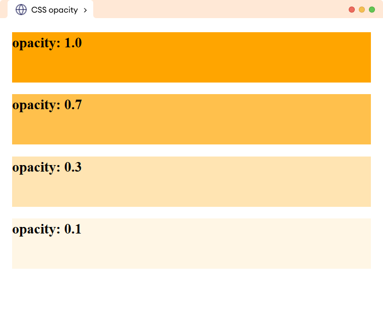
Here, the content of the h1 element is clearly visible while also maintaining the same previous opacity on the background color using the RGBA color value.
CSS Opacity with Image
The opacity property is often used to create hover effects for images by adjusting their transparency. For example,
<!DOCTYPE html>
<html lang="en">

    <head>
        <meta charset="UTF-8" />
        <meta name="viewport" content="width=device-width, initial-scale=1.0" />
        <link rel="stylesheet" href="style.css" />
        <title>CSS opacity</title>
    </head>

    <body>
        <img
src="https://images.unsplash.com/photo-1472214103451-9374bd1c798e?ixlib=rb-4.0.3&ixid=MnwxMjA3fDB8MHxwaG90by1wYWdlfHx8fGVufDB8fHx8&auto=format&fit=crop&w=1170&q=80"
            alt="A warm sunset"
        />
        <img src="https://images.unsplash.com/photo-1505765050516-f72dcac9c60e?ixlib=rb-4.0.3&ixid=MnwxMjA3fDB8MHxwaG90by1wYWdlfHx8fGVufDB8fHx8&auto=format&fit=crop&w=1170&q=80"
            alt="Cloudy mountains"
        />

    </body>
</html>
img {
width: 350px;
margin: 8px;
/* sets the opacity to 0.6 (60%) */
opacity: 0.6;
}
/* sets the opacity to 1 (100%) on hovering image */
img:hover {
opacity: 1;
}Browser Output

