The flex layout provides an efficient and flexible way to layout, align, and distribute the space among elements within a container.
Before flexbox layouts, designers and developers had to use table, float, and position properties to create complex layouts.
The flexbox layout provides an easy way to create responsive and dynamic designs that adapt to various screen sizes and devices.
Flex Container and Flex Items
The flex container and flex items are the key concepts behind the flex layouts.
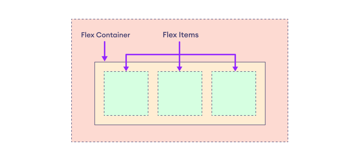
In order to create a flex layout, we first need to set up a flex container. Any element can be set as a flex container using display: flex declaration.
The elements within a flex container are referred to as flex items. The available space within the container can be distributed efficiently among the flex items.
Let's look at an example.

Here, the large purple box is the flex container with three flex items in orange boxes.
We will learn more about the flex container and flex items in the next articles. For now, let's look at some fundamental flexbox terminologies.
Flexbox Terminologies
There are various terminologies to describe the arrangement of flex items in the container.
The following diagram shows the basic flexbox terminologies. 
Here,
- main axis: The main axis refers to the primary axis along which the flex items are arranged within the flex container. It can be in either horizontal or vertical direction.
The main axis depends upon the value of the flex-direction property.
The row value of the flex-direction property sets the main axis to the horizontal direction, while the column value sets the main axis to the vertical direction.
In the above diagram, the main axis is horizontal direction as the flex-direction property is set to row.
- main start and main end: The main start is the starting edge of the main axis, and the main end is the ending edge. In other words, where the flex items start and end along the main axis.
- main size: The main size refers to the size of the flex item along the main axis of the container. This can be width or height, depending on whether the main axis is horizontal or vertical.
- cross axis: The cross axis is the perpendicular axis to the main axis. If the main axis is horizontal, the cross axis is vertical, and vice versa.
- cross start and cross end: These refer to the beginning and end edges of the cross axis within the flex container. In other words, where the flex items start and end along the cross-axis.
- cross size: The cross size is the size of the flex item along the cross axis of the container. Again, this can be width or height, depending on the direction of the cross-axis.
The flex layout involves both the properties of the flex container and the properties of the flex items within that container. These properties work together to control how the layout and alignment of the items occur.
To learn more, visit CSS Flex Container and CSS Flex Items.
Note: Flexbox is suited for layouts with a single direction, either horizontal or vertical, while grid layout offers powerful capabilities for complex layouts with both directions.