Pandas provides a convenient way to visualize data directly from DataFrames and Series using the plot() method.
This method uses the Matplotlib library behind the scenes to create various types of plots.
Let's learn about visualization techniques in Pandas.
Dataset For Data Visualization
We'll use the following dataset to visualize data.
| Car | Weight |
|---|---|
| Caterham | 0.48 tons |
| Tesla | 1.7 tons |
| Audi | 2 tons |
| BMW | 2 tons |
| Ford | 2.5 tons |
| Jeep | 3 tons |
Line Plot For Data Visualization
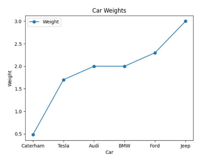
In Pandas, line plot displays data as a series of points connected by a line. We use the plot() function to line plot the data, which takes two arguments; x and y coordinate.
Let's look at an example.
import pandas as pd
import matplotlib.pyplot as plt

car = ["Caterham", "Tesla", "Audi", "BMW", "Ford", "Jeep"]
weight = [0.48, 1.7, 2, 2, 2.3, 3]

# create a DataFrame
data = {'Car': car, 'Weight': weight}
df = pd.DataFrame(data)

# plot using Pandas
df.plot(x='Car', y='Weight', kind='line', marker='o')
plt.xlabel('Car')
plt.ylabel('Weight')
plt.title('Car Weights')
plt.show()
Output

Here, we have used the plot() function to line plot the given dataset. We set the x and y coordinate of plot() as the car and weight.
The kind parameter is set to 'line' to create the line plot, and marker is set to 'o' to display circular markers at data points.
Scatter Plots For Data Visualization
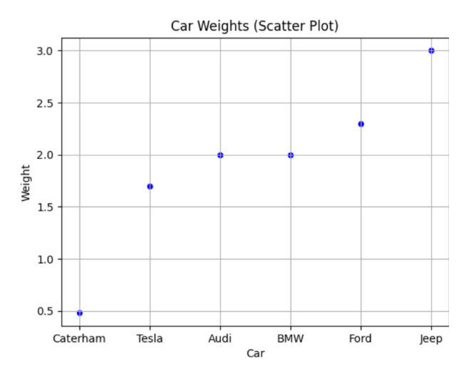
Scatter Plot displays data as a collection of points. We use the plot() function with kind = 'scatter' to scatter plot the data points. For example,
import pandas as pd
import matplotlib.pyplot as plt

car = ["Caterham", "Tesla", "Audi", "BMW", "Ford", "Jeep"]
weight = [0.48, 1.7, 2, 2, 2.3, 3]

# create a DataFrame
data = {'Car': car, 'Weight': weight}
df = pd.DataFrame(data)

# scatter plot using Pandas
df.plot(x='Car', y='Weight', kind='scatter', marker='o', color='blue')
plt.xlabel('Car')
plt.ylabel('Weight')
plt.title('Car Weights (Scatter Plot)')
plt.grid(True)
plt.show()
Output

In this example, we've used the kind='scatter' parameter in the plot() method to create a scatter plot.
The marker parameter is set to 'o' to display circular markers, and the color parameter is set to 'blue' to specify the marker color.
Bar Graphs For Data Visualization
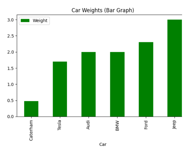
Bar Graphs represent data using rectangular boxes. In Pandas, we pass kind = 'scatter' inside plot() to plot data in a bar graph.
Let's see an example.
import pandas as pd
import matplotlib.pyplot as plt

car = ["Caterham", "Tesla", "Audi", "BMW", "Ford", "Jeep"]
weight = [0.48, 1.7, 2, 2, 2.3, 3]

# create a DataFrame
data = {'Car': car, 'Weight': weight}
df = pd.DataFrame(data)

# bar graph using Pandas
df.plot(x='Car', y='Weight', kind='bar', color='green')
plt.xlabel('Car')
plt.ylabel('Weight')
plt.title('Car Weights (Bar Graph)')
plt.tight_layout()
plt.show()
Output

Here, we've used the kind='bar' parameter in the plot() method to create a bar graph. The color parameter is set to 'green' to specify the color of the bars.
The plt.tight_layout() function is used to ensure that the plot layout is adjusted properly.
Histograms For Data Visualization
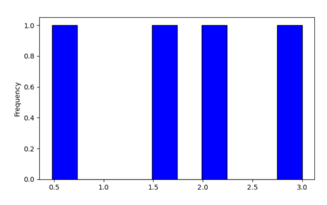
In Pandas, we use kind='hist' inside plot() to create a histogram. For example,
import pandas as pd
import matplotlib.pyplot as plt

weight = [0.48, 1.7, 2, 3]

# create a DataFrame
data = {'Weight': weight}
df = pd.DataFrame(data)

# histogram using Pandas
df['Weight'].plot(kind='hist', bins=10, edgecolor='black', color='blue')
plt.show()
Output

In this example, we created a histogram of the weights using the plot() method and then displayed it using plt.show().
To learn more, visit Pandas Histogram.