Pandas histograms is a graphical representation of the distribution of numerical data. In Pandas, using the hist() function, we can create and plot histograms.
We'll take a closer look at histograms and how they can be created and plotted in Pandas.
Pandas Histogram
Pandas has a built-in function hist() that takes an array of data as a parameter.
In histogram, a bin is a range of values that represents a group of data. bin is an optional parameter.
Let's look at an example.
import pandas as pd
import matplotlib.pyplot as plt

# create a DataFrame
data = {'values': [18, 21, 22, 25, 28, 30, 32, 34, 35, 36, 38, 40, 42, 45, 50, 55, 60, 65, 70]}
df = pd.DataFrame(data)

# plot a histogram
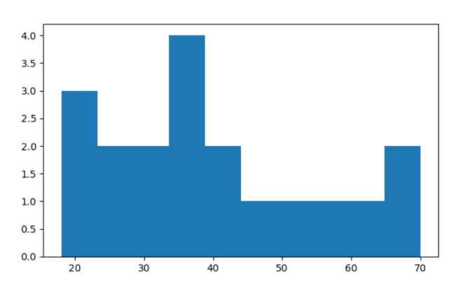
plt.hist(df['values'], bins=10)
plt.show()
Output

In this example, we have used the hist() function to create a histogram.
Inside the hist() funcion,
df['values']creates a histogram from thevaluescolumn of the DataFramebins=10specifies that the data should be divided into 10 bins or intervals.
Pandas Customized Histogram
A customized histogram is a type of histogram with specific visual characteristics that effectively communicate information about the data being displayed.
Let's look at an example.
import pandas as pd
import matplotlib.pyplot as plt

# create a DataFrame with more data
data = {'values': [23, 45, 30, 50, 67, 35, 47, 62, 25, 58, 42, 36, 53, 68, 32]}
df = pd.DataFrame(data)

# plot a customized histogram
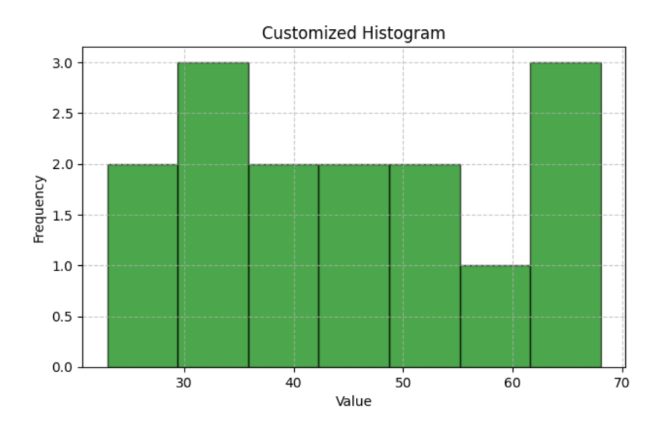
plt.hist(df['values'], bins=7, edgecolor='black', color='green', alpha=0.7)
plt.title('Customized Histogram')
plt.xlabel('Value')
plt.ylabel('Frequency')
plt.grid(True, linestyle='--', alpha=0.7)
plt.show()
Output

Here, in the customized histogram, we have used additional visual customizations such as color, transparency, grid lines, making it more visually appealing than the basic one.
Multiple Histograms in Pandas
In Pandas, we can create multiple histograms to compare different datasets. For example,
import pandas as pd
import matplotlib.pyplot as plt

# Create two DataFrames with different datasets
data1 = {'values': [12, 15, 18, 22, 25, 27, 30, 33, 37, 40]}
data2 = {'values': [8, 10, 14, 20, 24, 28, 32, 36, 42, 45]}
df1 = pd.DataFrame(data1)
df2 = pd.DataFrame(data2)

# Plot two histograms side by side
plt.hist(df1['values'], bins=6, edgecolor='black', alpha=0.7, label='Dataset 1')
plt.hist(df2['values'], bins=6, edgecolor='black', alpha=0.7, label='Dataset 2', color='orange')
plt.title('Histogram Comparison')
plt.xlabel('Value')
plt.ylabel('Frequency')
plt.legend()
plt.show()
Output

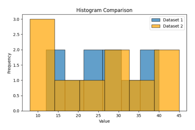
In this example, we have compared two histograms side by side, illustrating the frequency distribution of values in two separate datasets.
The first dataset's histogram is labeled Dataset 1 and uses default colors, while the second dataset's histogram is labeled Dataset 2, uses orange bars.