Bar Plots is one of the most efficient ways of representing datas. It can be used to summarize large data in visual form.
Bar graphs have the ability to represent data that shows changes over time, which helps us to visualize trends.
Create Bar Plot in R
In R, we use the barplot() function to create bar plots. For example,
temperatures <- c(22, 27, 26, 24, 23, 26, 28)

# bar plot of temperatures vector
result <- barplot(temperatures)

print(result)
Output
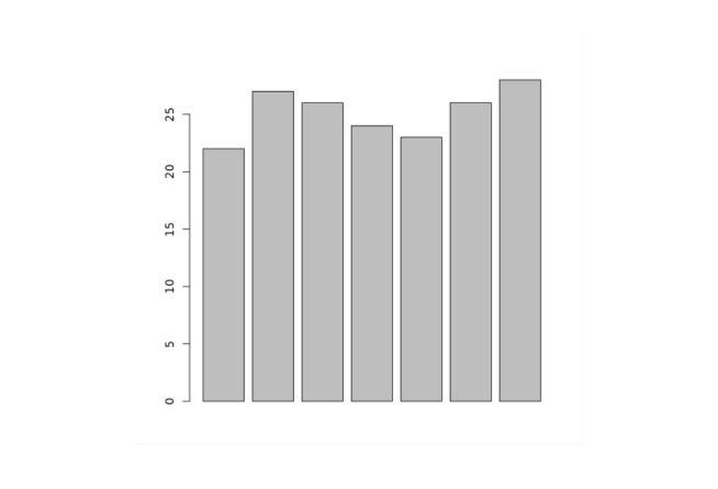
In the above example, we have used the barplot() function to create a bar plot of the temperatures vector.
The bar plot we have created above is plain and simple, we can add so many things to the bar plot.
Add Title to a Bar Plot in R
To add a title to our bar plot in R, we pass the main parameter inside the barplot() function. For example,
temperatures <- c(22, 27, 26, 24, 23, 26, 28)

result <- barplot(temperatures,
  main = "Maximum Temperatures in a Week")

print(result)
Output
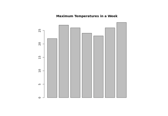
In the above figure, we can see that we have added a title to the bar plot of the temperatures vector.
barplot(temperatures, main = "Maximum Temperatures in a Week")
Here, the main parameter adds the title "Maximum Temperatures in a Week" to our bar plot.
Provide Labels to Axes in R
In R, we can also provide labels for the x-axis and y-axis. For example,
temperatures <- c(22, 27, 26, 24, 23, 26, 28)

result <- barplot(temperatures,
  main = "Maximum Temperatures in a Week",
  xlab = "Degree Celsius",
  ylab = "Day")

print(result)
Output
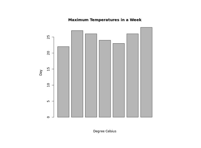
In the above example, we have provided labels for the x-axis and y-axis respectively.
barplot(temperatures,
  ...
  xlab = "Degree Celsius",
  ylab = "Day")
Here, we have provided additional xlab and ylab parameters to barplot()
xlab- provides the"Degree Celsius"label for the x-axisylab- provides the"Day"label for the y-axis
Provide Names for Each Bar of Bar Plot in R
We pass the names.arg parameter inside barplot() to provide names for each bar in R. For example,
temperatures <- c(22, 27, 26, 24, 23, 26, 28)

result <- barplot(temperatures,
  main = "Maximum Temperatures in a Week",
  xlab = "Degree Celsius",
  ylab = "Day",
  names.arg = c("Sun", "Mon", "Tue", "Wed", "Thu", "Fri", "Sat")
)

print(result)
Output
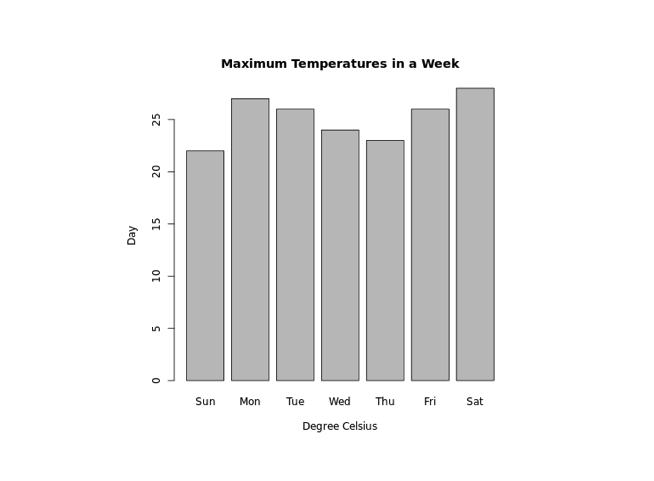
In the above example, we have used the names.arg parameter to provide names to each bar of the bar plot. Notice the code,
barplot(temperatures,
  ...
  names.arg = c("Sun", "Mon", "Tue", "Wed", "Thu", "Fri", "Sat")
)
Here, we have assigned "Sun" to the first bar, "Mon" to the second bar and so on.
Change Bar Color in R
In R, we pass the col parameter inside barplot() to change the color of bars. For example,
temperatures <- c(22, 27, 26, 24, 23, 26, 28)

result <- barplot(temperatures,
  main = "Maximum Temperatures in a Week",
  xlab = "Degree Celsius",
  ylab = "Day",
  names.arg = c("Sun", "Mon", "Tue", "Wed", "Thu", "Fri", "Sat"),
  col = "blue"
)

print(result)
Output
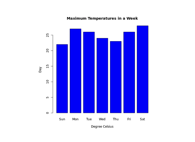
In the above example, we have used the col parameter inside barplot() to change the color of bars.
result <- barplot(temperatures,
  ...
  col = "blue"
)
Here, col = "blue" changes the color of bars to blue.
Bar Texture in R
To change the texture of bars in R, we pass the density parameter inside barplot(). For example,
temperatures <- c(22, 27, 26, 24, 23, 26, 28)

result <- barplot(temperatures,
  main = "Maximum Temperatures in a Week",
  xlab = "Degree Celsius",
  ylab = "Day",
  names.arg = c("Sun", "Mon", "Tue", "Wed", "Thu", "Fri", "Sat"),
  col = "blue",
  density = 20
)

print(result)
Output
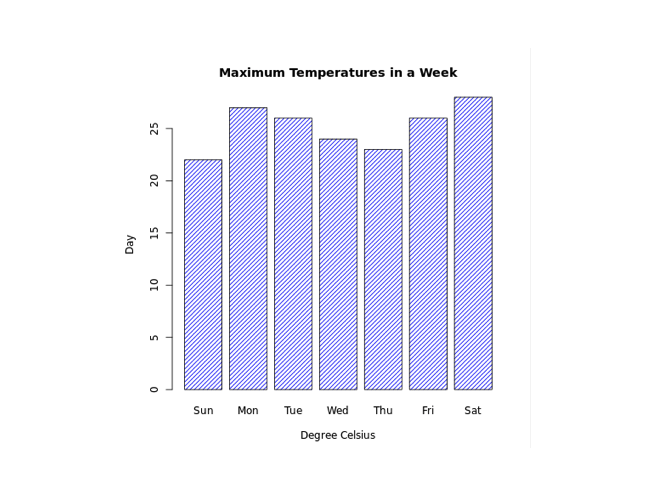
In the above example, we have used the density parameter inside barplot() to change the texture of bars.
result <- barplot(temperatures,
  ...
  col = "blue"
  density = 20
)
Here, density = 20 provides the texture of density 20 to all the bars which are of color blue.
Make Bar Plot Horizontal in R
In R, to make our bar chart horizontal, we pass the horiz parameter inside barplot(). For example,
temperatures <- c(22, 27, 26, 24, 23, 26, 28)

result <- barplot(temperatures,
  main = "Maximum Temperatures in a Week",
  xlab = "Degree Celsius",
  ylab = "Day",
  names.arg = c("Sun", "Mon", "Tue", "Wed", "Thu", "Fri", "Sat"),
  col = "blue",
  density = 20,
  horiz = TRUE
)

print(result)
Output
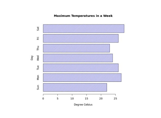
Here, horiz = TRUE passed inside barplot() changes the orientation of our chart to horizontal.
Stacked Bar Plot in R
R allows us to create stacked bars by using a matrix as input values. For example,
# create a matrix
titanic_data <-  matrix(c(122, 203, 167, 118, 528, 178, 673, 212),
nrow = 2, ncol = 4)

result <- barplot(titanic_data,
main = "Survival of Each Class",
xlab = "Class",
names.arg = c("1st", "2nd", "3rd", "Crew"),
col = c("red","green")
)

legend("topleft",
c("Not survived","Survived"),
fill = c("red","green")
)

print(result)
Output
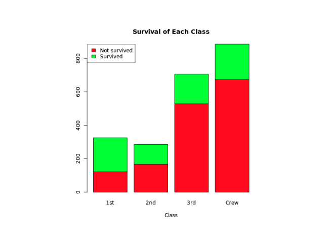
In the above example, we have created a matrix named titanic_data with 1st row containing data of non-survivals and 2nd row with data of survivals.
barplot(titanic_data,
  ...
)
Here, we have passed titanic_data inside barplot() to create stacked bars.
We have also used the legend() function to add legend to our bar chart.
"green"color represents"Survived""red"color represents"Not Survived".